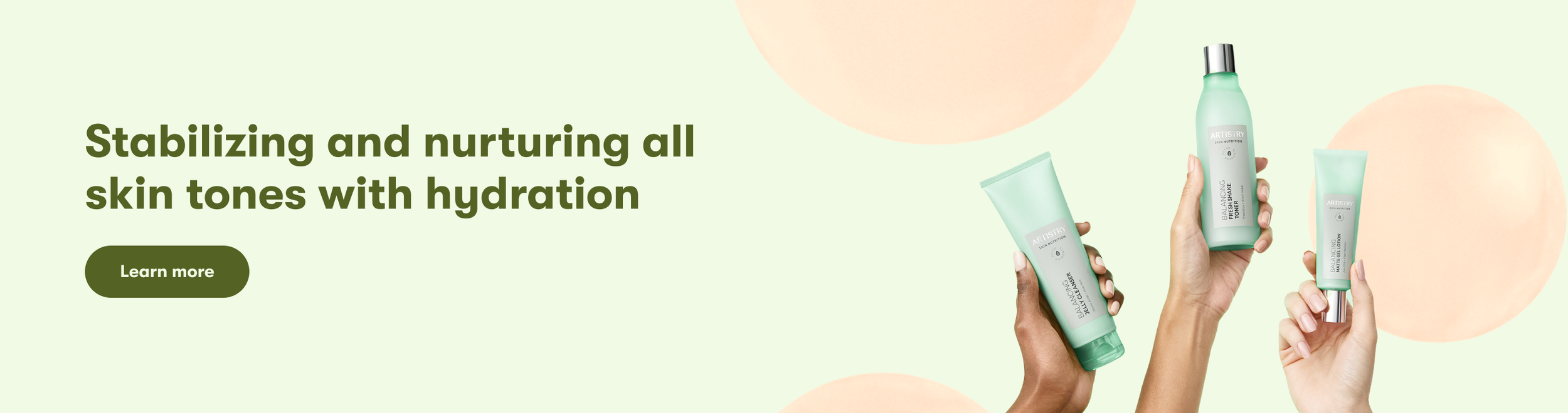
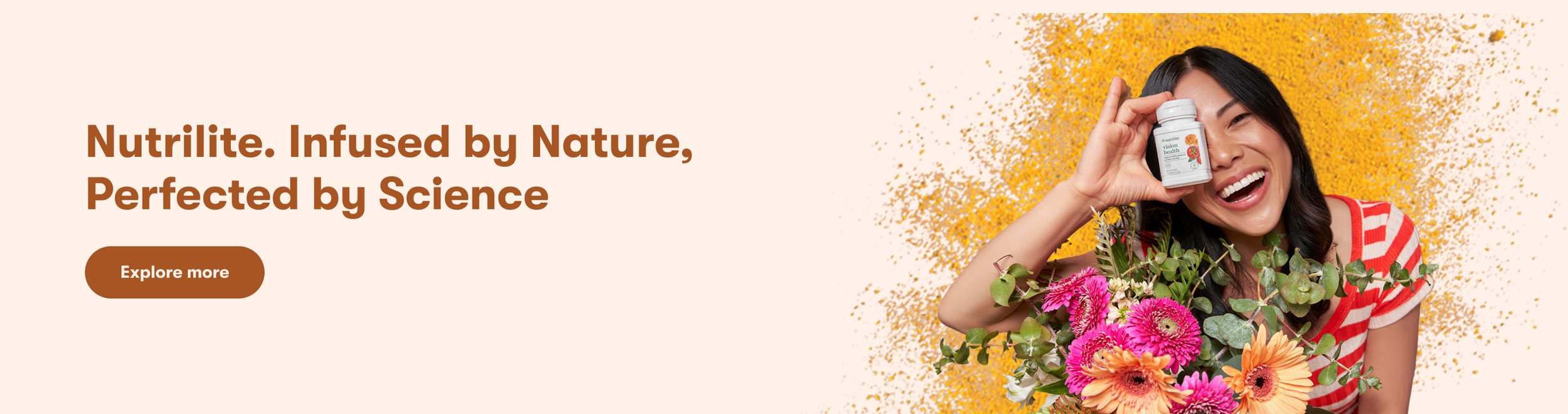
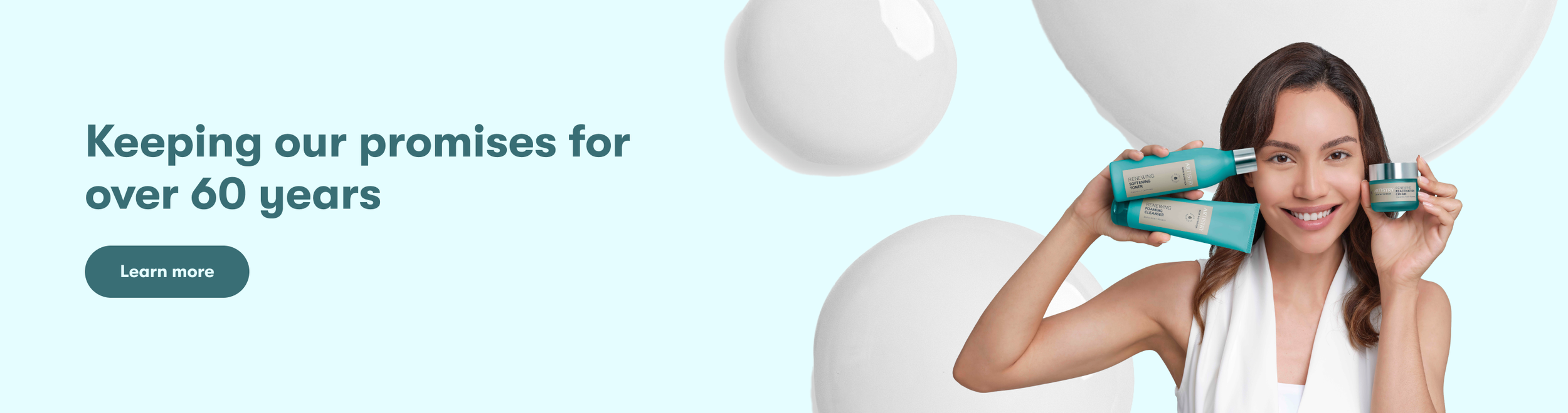
Amway Italy Hero Banner
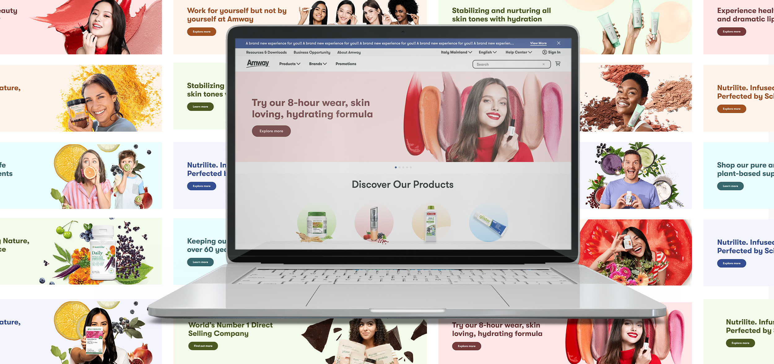
As the Senior Designer, I provided solutions to enhance the quality of Amway Italy’s website. For this project, instead of using subtle, faded textures in the background of the site’s hero banners, I proposed using ones that are big, bold, and meaningful that fill in white space, add value, color, and are intentional.
Brand Design
Website Design
Digital Design
Role: Senior UI/UX Designer
2024
Amway
The Problem
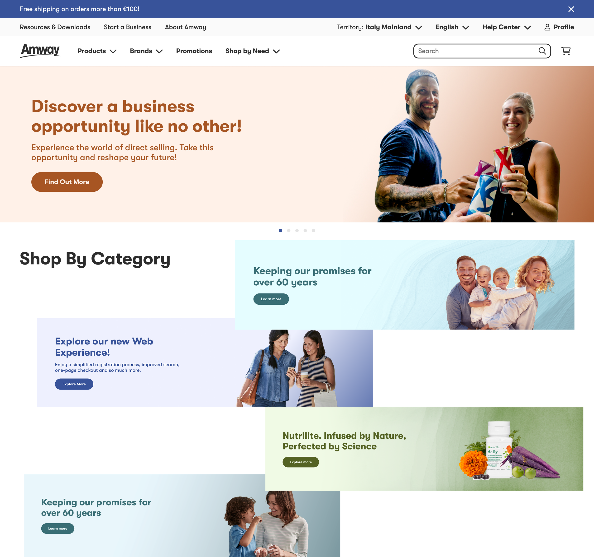
The original shop header suffered from major layout and visual limitations.
The underlying code created restrictions on background implementation due to the outdated and off-brand gradients, creating UI inconsistencies.
The Solution
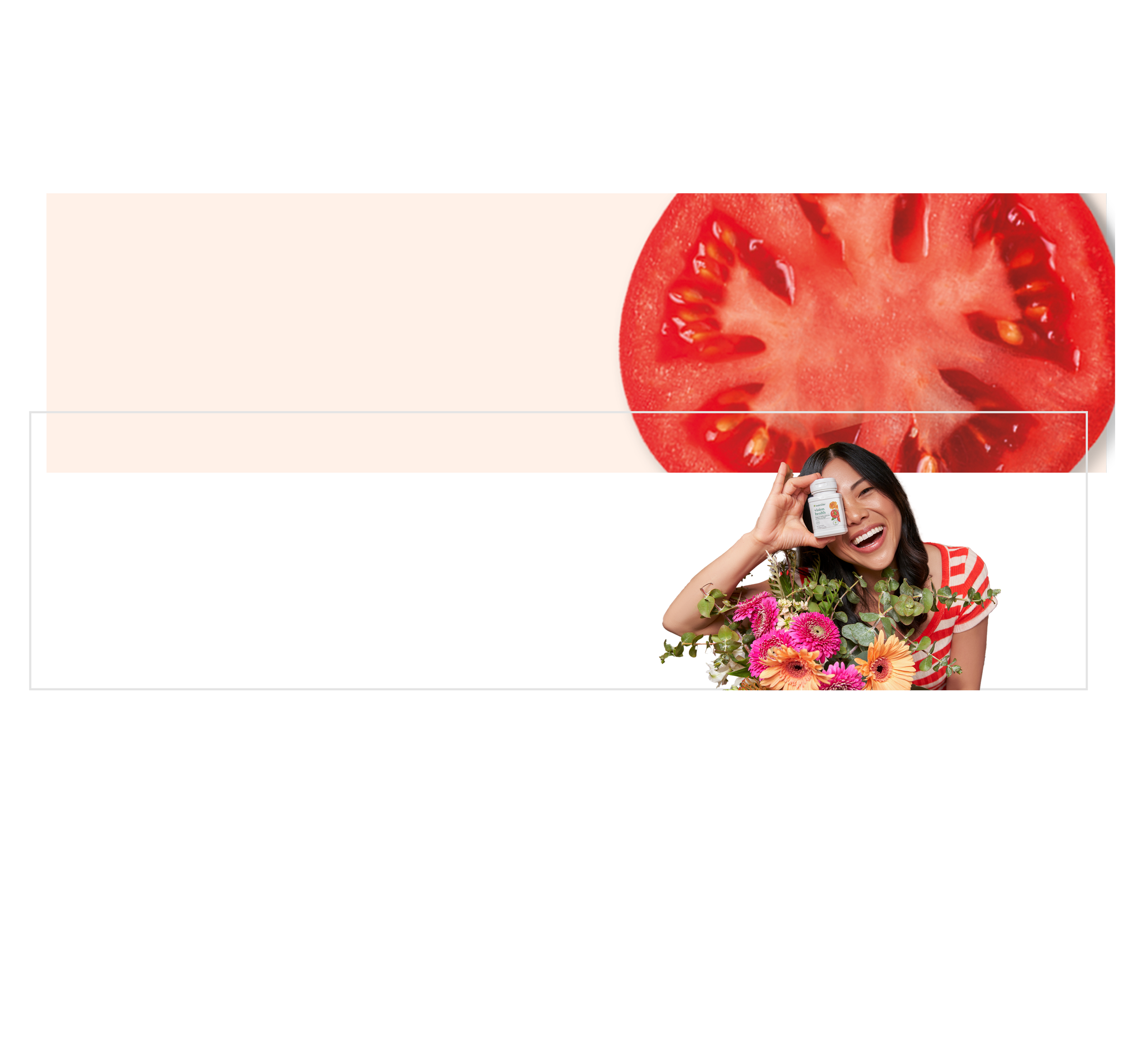
After diving into the codebase, I found a way for the system to support both background and foreground image layers.
In efforts to avoid burning dev bandwidth on a custom fix, I found a creative way to solve it within the existing code:
Background Layer: Created custom texture assets (like vibrant lipstick swatches) aligned to the right, leaving the left text zone completely clear for text.
Foreground Layer: Photoshopped out lifestyle and product subjects with transparent backgrounds to sit over the textures.
The Impact
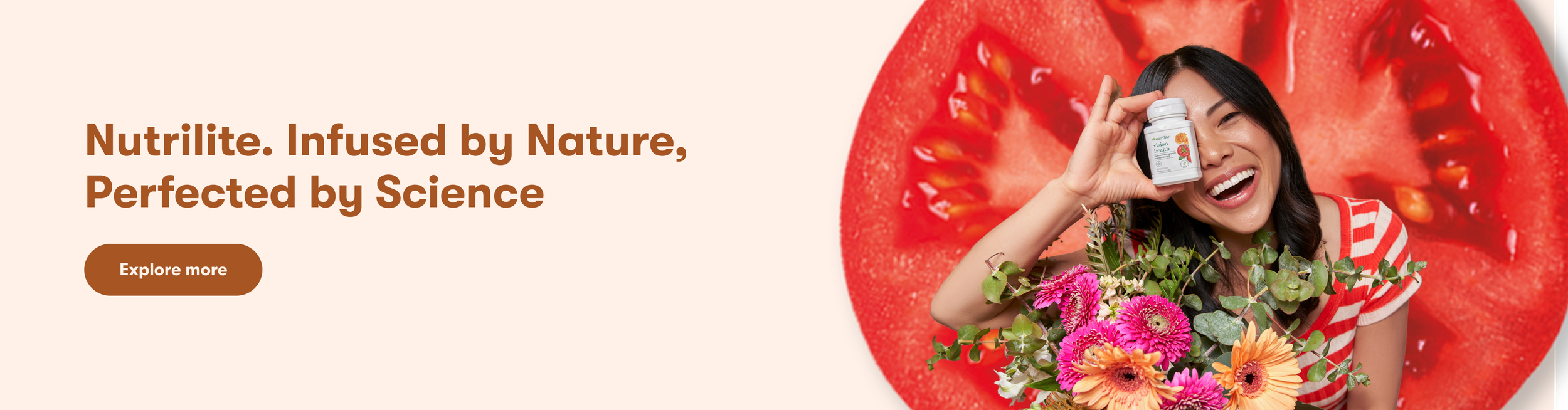
Combining the two layers created rich, high-fidelity hero visuals that gave the page depth and energy while keeping text legible on every device.